


The Creative Challenge
Shifra Tech, a new IT firm based in Lebanon, required a foundational logo and brand identity that immediately conveyed three specific concepts:
-
Identity
The logo must clearly feature the letter 'S'.
-
Industry
The mark needed to be unequivocally recognized as a technology company.
-
Vision
The design must visually communicate that Shifra is a multi-directional company with a diverse and scalable range of technological products.
The Execution
To meet these complex visual requirements, I moved beyond standard typography and pursued a custom logomark utilizing geometric construction and negative space:
-
Technology & 'S' Formation
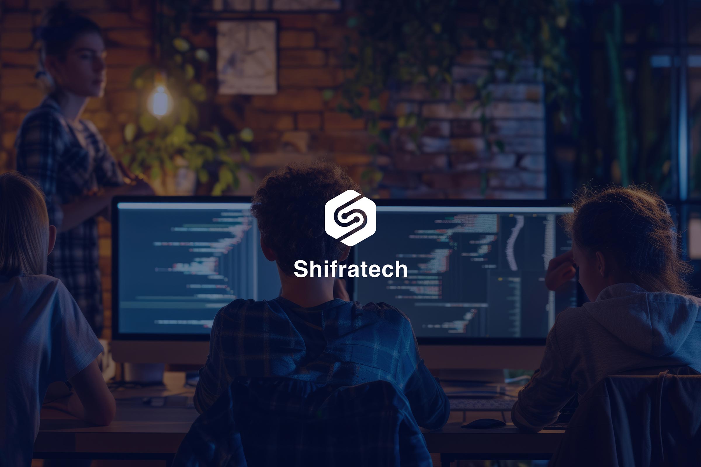
The lettermark was constructed using a custom design (not a font) featuring two curving lines. Together, these lines fluidly form a dynamic and distinctive letter 'S', satisfying the core identity requirement.
-
The Technological Wire
Circles were added to the ends of these lines to represent wiring or circuit connections, establishing the company's technological foundation.
-
Multi-Directional Vision
To convey the multi-directional vision, I tilted the 'S' shape by 30 degrees and placed it within a hexagon using negative space. The hexagon visually suggests a strong, adaptable structure capable of moving in multiple directions, reflecting the company's diverse product range and scalable growth.
Results
The palette combines Stratos (a deep blue for trust) and Cyan/Aqua (for a modern tech feel). Azure Radiance adds necessary vibrancy and a forward-looking dimension to the final mark.


